
Great Usability on Colorado Health Exchange Web Site
Note: This post was not sponsored in any way.
The only thing I did on the first day was sign up. I know everyone had problems that day, all over the country.
And as a huge supporter of the Affordable Care Act (ACA), I am bummed to hear about continuing issues on the national level.
As a web developer who used to co-own a company that built multimillion dollar web sites for the government, I understand it… even though it is still disappointing.
And when I say “I understand,” I don’t mean in the usual “everything government does sucks” way – I mean that building a site like this is incredibly, incredibly difficult with immense layers of security and privacy issues.
I would NOT have wanted to tackle it.
Today I sat down and went through the Connect For Colorado web site, our version of the Obamacare health exchange. I did not buy anything yet, because I need time to compare what is available to what we have through my husband’s company, but I just wanted to share some screen caps… to commend these folks on their GREAT web site.
It is filled with nice usability, great explanations. It does exactly what I wanted it to do, in large, easy-to-read type. I can compare plans, see details. I had zero problems doing any of this, and if I do end up buying – hopefully that transaction will run very smoothly as well.

I love the large buttons, and how the left navigation is taking you through the steps of the process. Also, green and blue have been routinely tested as easier to read for seniors.
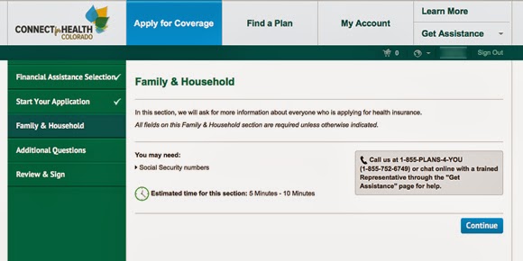
Notice how this section preps you for the documents you should gather and how long it will take you. Plus has a call out button with a 800 number to speak to a real person if the web site is a bit too much for you.
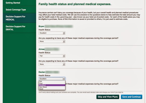
Here they discuss that you cannot be denied health insurance anymore (THANK YOU THANK YOU THANK YOU), but you rate yourself to help estimate expenses later.
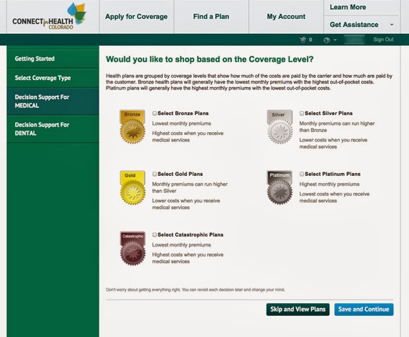
If you would like to look at plans in general terms, select that here. Meaning they have groups high premium, high coverage together, and simple catastrophic coverage together – thus you don’t have to look at ALL the plans.

And then the plans come up. With quick info, symbols, ratings, and the ability to select plans to compare against each other. I love the sliders on the left that you can move the costs to your individual situation and the plans will update based on that. You can sort them in varies ways, including if you want to be with a specific carrier. Basically exactly what I wanted and expected to see when shopping for health insurance.
Great job, Colorado!
Greeblehaus is a Denver-based music and travel blog sharing concert photography, reviews, and stories from live music across Colorado and beyond. You can find more upcoming shows in our Denver concert calendar.
You May Also Like


This article has 6 comments
Comments are now closed.
Wow that does look really good.
very nice wrap up! Love the screen shots. I haven’t been on the site myself so it was great to see the interface.
Totally agree. Bummed about national health care web site, but woe – what a crazy thing to try and build. right?
Thanks for showing this. Nice to see SOMEONE is getting it right.
Yes great blog love reading it here
I had to try the national site, but wish our state had one too.